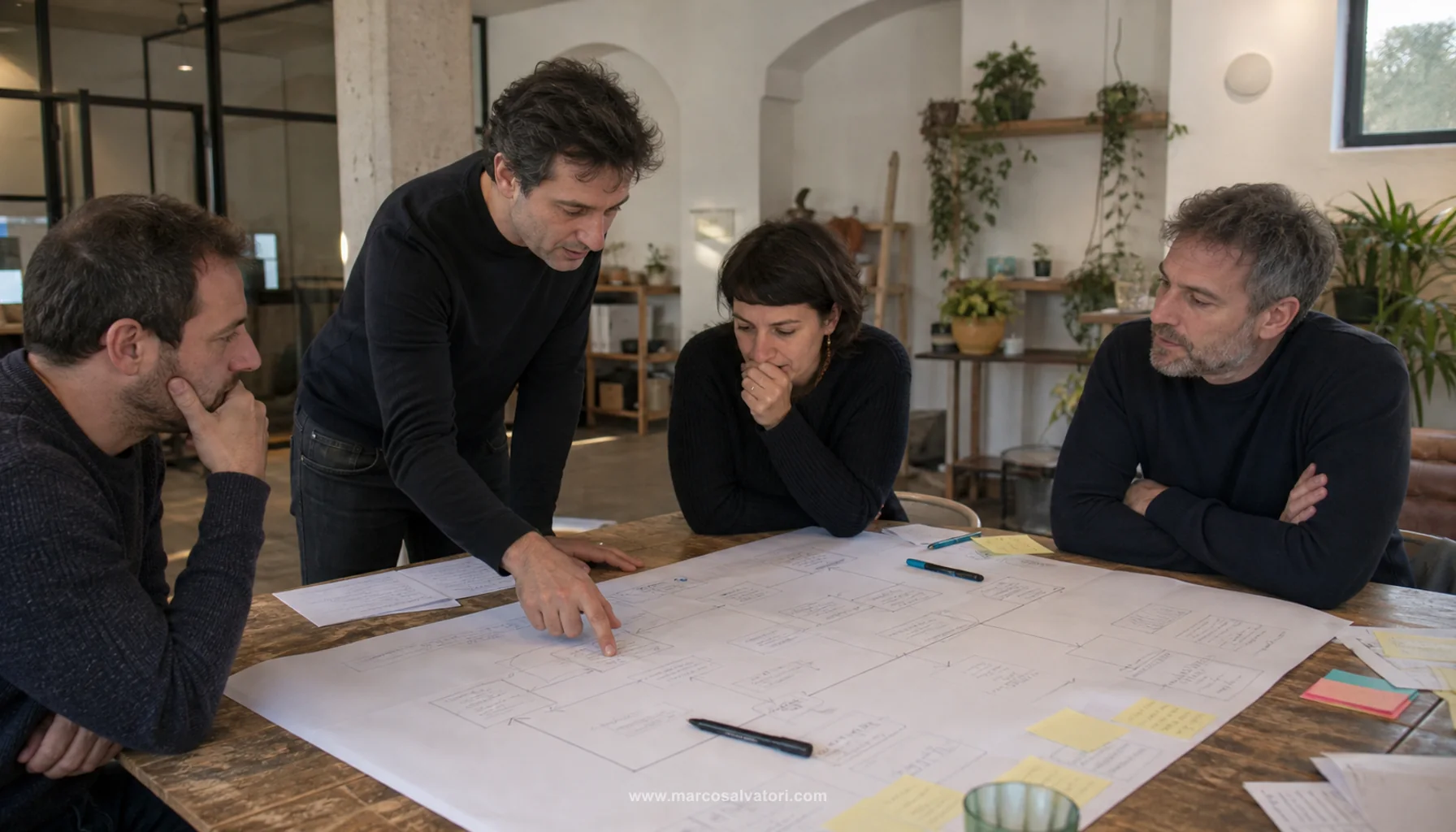


1. Define a Mobile Friendly Design
A mobile-friendly design is a design that adapts to mobile devices such as smartphones and tablets. It's a design that is optimized for viewing on small devices, with intuitive navigation and a smooth user experience. A mobile-friendly design is essential to ensuring that your website visitors have a positive browsing experience, regardless of the device they use.
2. Use a Responsive Grid
One of the easiest ways to create a mobile friendly design is to use a responsive grid. A responsive grid is a layout grid that automatically adapts to your device. This means that your website will automatically adapt to mobile devices, ensuring that content displays correctly on any device. Additionally, a responsive grid can help maintain good organization of contents and improve readability.
3. Use appropriately sized fontss
Another way to create a mobile friendly design is to use appropriately sized fonts. When designing a website, it's important to make sure the fonts are large enough to be readable on a mobile device. Fonts that are too small can make content difficult to read, making for a negative user experience. Also, it's important to make sure the fonts are suitable for the design and that they are easily readable on any device.
4. Use High Quality Images
Finally, it is important to use high quality images when creating a mobile friendly design. Low-quality images may appear blurry or pixelated on mobile devices, which can negatively impact user experience. Make sure you use high quality images that are optimized for viewing on mobile devices. Also, make sure the images are of appropriate size and that they do not slow down the loading of the site.